Showing posts with label cool things on the internet. Show all posts

Monday, December 9, 2013

Cubism. Realism. Sciencism.

Post-impressionist carcinoma.

This week's post from me will be relatively brief as I am currently on honeymoon, and although Shaun somehow manages to find time on his travels to blog about his conference experiences I doubt my new wife would be too happy if I did likewise! So, in lieu of my intended Human Machine series post (which will be coming early in the new year), I wanted to bring your attention to something wonderful going on at the Cell Picture Show.

The Cell Picture Show has appeared in the Trenches before (here and here), but this recent instalment is to me even more original and interesting than anything they've had before. The image above has two halves, both of which are strikingly reminiscent of Van Gogh's famous and beautiful Starry Night. They look like the product of some brilliant mind with an extraordinary mastery of colour and texture. In fact, the image on the left is a cross section of mouse skin containing basal skin carcinoma, with various components stained different colours and imaged using a fluorescence microscope. The image on the right is an artist's rendering of the same image using different coloured fabrics stitched together. This is part of Cell's exhibition 'Art Under the Microscope', in which images of biological samples are recreated into works of art by professional artists. The image above is just one example, but there are many others of similar standard available in the exhibition. The technical prowess of the researchers who obtained the original images is impressive, as are the aesthetic abilities of the artists who recreated them.

A fire-like network of neural stem cells in the human brain (left) and their artistic equivalent (right).

What I find so exciting about this exhibition is that it is redefining what can be the subject of art, and what can be the source of artistic inspiration. Nature has been inspiring artists for thousands of years, why should that be restricted to what we can see with our own eyes? We are now at a level of technology that we can begin to unveil many of the secrets that nature had previously been hiding from art. This should be exciting to both scientists and artists. Artists can be excited by the wealth of new subject matter that is beginning to open up to them, and scientists can be excited by the prospect of art adding to the ever-growing popularity and appreciation of science. Perhaps one day there will be great debates in artistic circles about new avant-garde artists who paint their proteins in a controversial way, much like the debates between the surrealists and romanticists on how to depict more macroscopic areas of nature. 

Although 'Art Under the Microscope' is a small exhibition, it nonetheless marks a growing trend in the use of science as inspiration for art. I sincerely hope that this continues as it will enrich both science and art, and help to blur the boundaries between them. Art has been very successful in entering many concious aspects of our daily lives, and we are the better for it. Science is still catching up in many regards, although to be fair it hasn't had all that long to make up the difference. If science were as exposed in the public conciousness and as everyday as art is, then I believe we would benefit similarly as we have from the ubiquity of art. The fusion of the two is a match made in heaven that is finally beginning to take hold. I look forward to the days when parks are adorned with pieces of science-based public art, and the spectrum of human endeavour is appreciated as single entity rather than as the separated, delineated pigeon holes of 'art' and 'science' as discrete subjects.


Monday, December 10, 2012

Cinema verité - biology style

Animations of scientific principles are becoming more and more popular as a way of condensing complex data into an easily accessible format, particularly in the field of biology. Nonetheless, a recent article in Nature has raised a number of interesting points about how the visualisation of biological processes should not be taken lightly. Biology is unnervingly complex and there is still much that we don't understand - how are we to know how much of an animation is based on actual data and how much is just 'filling in the gaps'? This is not limited to the layperson - humans are very visual creatures and we are more easily swayed by pictures than words, experts are no exception. This is not new, journals have included idealised representations of biological processes for decades, but the advancement in computer animation has opened the door for more sophisticated animations that may imply a more thorough understanding where one does not exist. 

That said, I don't believe that researchers actively seek to mislead when presenting their findings in animated form, rather that they have to take the necessary steps to complete the movie - inherently requiring some artistic licence. And, for the most part, the bits being filled in are done so with reasonable scientific assumptions in mind and are not wild fantasy. The medium is an exciting one, and one that will hopefully play a significant role in not only disseminating scientific understanding, but also help to further research by highlighting gaps in our understanding. We must, however, always be vigilant when interpreting these animations as they are exactly that - animations - and not actual footage of molecular biology.

An excellent example of biological animation is the 'Inner Life of a Cell' video by a group in Harvard. I love this video, which depicts the events that occur upon the activation of T cell, and is pretty accurate in that almost everything show is backed up by real evidence. The 'motor protein' kinesin at 3:40 is particularly impressive because its mechanism of 'walking' along microtubules is backed up by extensive structural and biochemical studies, yet it just looks so much like a drunk guy who's been pulled over by the police and is trying to walk in a straight line! If you get the chance, I really recommend watching the video and reading the article mentioned above. Enjoy!


Tuesday, November 6, 2012

Science and Video Games

A long time ago I posted about an online game called FoldIt. After I made that post various other examples of crossovers between video games and science have been brought to my attention. Many of these, I have linked to from The Trenches of Discovery's Facebook and Google+ pages and some I've been saving for a rainy day. (Note, we often post links/comments to those pages when we don't consider them worth a whole blog post. If you read this blog, but aren't following either of those pages, you're missing out on some interesting stuff. You should remedy this.)

Well, it isn't rainy, but it is foggy, so the day has as good as come. What follows is a run through of some of the various science/video game crossovers I'm aware of. Some of these are neat video games, designed to either teach an aspect of science, or  try to give a phenomenological experience of what that aspect of science means for the world. Others are more like FoldIt, they are puzzle games that you try to solve, and in the process you're actually helping the scientists solve their research problems.

Phylo


Monday, September 17, 2012

Symphony of Science - Climate Change

Some of you may already be familiar with the 'Symphony of Science' YouTube series, but I thought I'd give it a plug here anyway. These are a collection of videos created from various documentaries and science programmes spliced together and auto-tuned to make a song on a specific area of science. I'll be honest, the 'song' aspect of it is not the greatest musical contribution that mankind's ever seen, but I still really like these videos because they encapsulate an entire idea in a way that is so commonly used to express other concepts but is so rarely applied to science. The topics covered range from evolution, to space travel, to quantum mechanics, and are all well worth a watch. 

In recent years I've felt a slowly increasing passion among the general population (in the UK, at least)  for good scientific broadcasting and innovative ways to present scientific principles. This is exemplified by the notoriety of a number of 'popular' scientists, such as Brian Cox or David Attenborough, and the fact that several celebrities that started out in general entertainment have now moved in the direction of scientific broadcasting, Dara O Briain and James May to name but two. Perhaps we here on this sceptred isle have been spoiled by the exemplary science programmes regularly released by the BBC, but I believe that innovative presentations of science have the capability to connect with people regardless of nationality. The Symphony of Science is just one such presentation and, even if it's not your cup of tea, it is undoubtedly innovative.

The latest installation in the series was released this week and covers the ever-topical issue of climate change. 


Monday, August 20, 2012

Pushing back the boundaries

The Red Planet?

The adventure of NASA's Mars Curiosity Rover took an exciting step forward today as the pioneering little machine vaporised its first rock with its cheerfully named 'ChemCam' laser. The Curiosity mission has tapped into a huge vein of public enthusiasm for investigation and the exploration of the unknown, exemplified by the fact that over a thousand people gathered in New York's Times Square to watch the live landing. Space exploration has often occupied a romantic place in the heart of public opinion, in part because of the wonderful images that can be beamed back, which can offer a more personal connection to the work being done and give people a greater sense of ownership over scientific endeavour. The Curiosity mission is no exception - NASA is dutifully publishing the images being sent back from Mars to the delight of those of us on Earth.

The potential for images to capture the public imagination has not gone unnoticed by other branches of science. Last year I published a post about the Cell Picture Show, a project by the biology journal Cell to highlight the most striking images emerging from the ever expanding field of biological microscopy. In this post I wanted to highlight a recent edition to the project: the super-resolution gallery.

Super-resoltion is a fairly recent step forward in microscopy that allows biologists to observe life's molecular events on an unprecedentedly small scale using a range of cunning technical tricks. Researchers can now follow individual molecules as they move across the surface of a cell, or observe the machinery of processes like DNA replication in fine detail. Just like Curiosity, the missions of super-resolution are pushing back the frontiers of knowledge and exploring the unknown; not going further, but looking smaller. I would definitely recommend giving this new gallery a look: here.  

Image is property of Cell and National Institute of Health - microtubules imaged by conventional (right) and super-resolution (left) microscopy within a Drosophila cell.


Wednesday, May 23, 2012

Collective Marvelling

We contribute at this blog because we thinking sharing fundamental research is important. The more other research blogs that exist similar to ours, the more there is out there for the world to encounter. This is definitely a good thing. However, the more blogs that exist, the harder it gets for people to find things in the maze.

With that in mind, I can happily announce that The Trenches of Discovery has co-founded Collective Marvelling, which is a network of blogs written by young researchers. Collective Marvelling will host snippets of every post written at one of the network's blogs, along with a link to the full post. The snippets will be posted at the same time as the full post is written, which makes Collective Marvelling a central place you can check regularly to keep track of all the blogs in the network at once (if you aren't a fan of rss).

There is now a permanent link to Collective Marvelling at the top of this blog. You should go and check it out. And while you're there, check out the other three founding blogs of the network, Blank on the Map, Cross Sections and Lumps 'N' Bumps.

We welcome any ideas for development of the network.

Thursday, April 19, 2012

The phenomenology of a fourth spatial dimension.

A hyperdimensional cube, known as a tesseract...

Part of the motivation for this blog was to open up a dialogue between working artists and working scientists. One of the conversations that is starting to develop relates to the (artistic) field of phenomenology and whether it does/doesn't have anything to say when it comes to the more abstruse sciences. Of course phenomenology is the study of the things humans experience (at least according to my rudimentary understanding of it) and scientists are human beings who experience abstruse science so phenomenology must have something to say about science, by definition. But what?

The discussions which began this conversation concerned two online applications that aid in the visualisation of the scales involved in time and space. See this post and this post and the comments in each for a discussion of the apps. In that discussion and in the comments to a later post I expressed a sense of disappointment in what these apps were managing to express. I should clarify that I think the apps are great and interesting, but if one is looking for a phenomenology of science I don't think this is where the most interesting phenomenology is (of course the app creators aren't looking for a phenomenology of science, so they are completely forgiven). The scale of space and time are very ordinary, everyday, Earthly things. The most interesting discoveries science has made, at least in the world of high energy physics, are not well described in such terms - this is almost precisely what makes them so interesting.

As Rhys pointed out in one of those comment threads a huge part of this problem is that many of these discoveries rely heavily on mathematics. And, to a very large degree, to understand the discoveries, you need to have a grasp of the maths. The fact that the very abstract structures and symmetries and patterns that lie hidden in the mathematics are then actually exhibited in the real universe is one of the more wonderful things experienced by a scientist. And that is not easily captured simply through pictures, videos and sounds (or even smells) of the universe.

However, I came across an app today that really does try to bridge this gap. If someone were to be looking for a true phenomenology of the more interesting and wonder inducing aspects of theoretical physics then this is the sort of thing one should be looking for. It is an app that simulates a hyper-dimensional cube. OK, so what on Earth does that mean?

Well, a dot exists in zero dimensions, it has no length, width, nothing. A line exists in one dimension, it has simply a length. A square exists in two dimensions, it has a length and a width. Next, a cube, exists in three dimensions, it has a length, a width and a depth. Now, just imagine there was a fourth spatial dimension. Mathematically this is an easy thing to write down. Then, just as one can form a cube by extending a square into a third dimension, one can form something known as a tesseract by extending a cube into a fourth spatial dimension.

Now, we creatures who exist in just three spatial dimension can't visualise a fourth spatial dimension (I certainly can't). But, just as we can look at a two dimensional surface (a TV screen) and see a projection of a three dimensional object, so can we do the same for an imagined four dimensional object projected onto three (or two) dimensions. And this is precisely what this app does for a four dimensional tesseract. [Edit: Or, as Rhys said in this comment "it shows what a 4D painter would paint on a 3D canvas..."]. And the brilliance is that the app even allows you to manipulate the tesseract, to move it, to spin it (in any of the four dimensions) and while manipulating it you see how that three dimensional projection changes on your two dimensional screen. Here's a video preview...


This app came to my attention as a consequence of minutephysics covering extra spatial dimensions in his latest video - which you should watch for a quick overview of higher dimension. There is even, apparently, a game in construction that requires you to move into and around a fourth spatial dimension to solve puzzles (for example using it to navigate one's way around obstacles and put keys into locks).

I actually think that a phenomenology of abstruse science can go even further and get even more interesting than this. A fourth spatial dimension is one of the simplest ideas I can think of that is not directly understandable from an Earthly perspective, but easily described by maths. It also has the unfortunate position of quite possibly not actually being reality and certainly not yet being testably true reality. However, it is here, with this sort of application/idea that I would think a phenomenology of the interesting bits of high energy physics should start.

Twitter: @just_shaun

Sunday, April 1, 2012

Phenemonology between Husserl and Heidegger

Cy Twombly, The First Part of the Return from Parnassus (1961)

Regular readers of this blog will have noticed the relatively recent addition of a blog-roll, in the form of a themed list of 'blogs we read.' That list is for active blogs, in my opinion, but I've found an inactive blog that I wanted to highlight because I think it speaks to some issues meaningful to the motivations of this endeavor for communication across disciplines and specializations: some of our themes of open access, vernacular writing on the web, and increasingly, phenomenology.

The blog, Between Husserl and Heidegger, is clearly an outcome of a graduate-level course in phenomenology at an American university, most likely one taught from a philosophy department or a department arrayed around the disciplinary study of philosophy. The posts are all summaries of the readings written by students in the class. I've written these kinds of excursus myself in graduate school, and have asked them of my own students. Writing a careful, detail-oriented account of someone else's argument is a great exercise in close and attentive reading, and hones sensitivity to the craft of constructing concepts.

So, the blog is a fragment of a course that has been left lying around on the web. It's useful in a number of ways for precisely this reason. For a specialist, it's a nice summary of names and books that reflects an interesting and informed syllabus. For non-specialists, it's an insight into how teaching and learning works in the humanities. For anyone interested in phenomenology, it's a great open-access bibliography — a source for the vocabularies, ideas, and contemporary histories of a topic I'm well aware isn't the most accessible out there.

The URL for the blog is erlebnis - the German word for 'lived experience' which acts as a central, motivating concept in all strands of twentieth-century phenomenology — as the blog's author himself notes. In keeping with his excellent taste, I've taken the image for this post from one of my favorite Cy Twombly paintings in the collection of the Art Institute of Chicago.

Friday, March 23, 2012

The scaling of time: ChronoZoom


One of the conversations that is starting to develop here at the blog relates to the concept of scale. In a recent comment, Michelle wrote about an application that aids with the visualisation of time-scales (although the application's designers see it as more of an interactive teaching tool).

Seeing as "Scale of the Universe" is so popular on the internet, I expect that this application, ChronoZoom, should become equally popular one day soon. Scale of the Universe allows you to zoom in and out of distance scales and it shows you the relevant physics, chemistry or biology at each scale. ChronoZoom kind of does the same for time. However it is quite a bit more detailed and much, much more ambitious as a project. Watch the video above, read a recent article on the project, and play with the application itself.

Michelle wrote in her comment that she finds visualising time-scales through this application more difficult than the equivalent for spatial-scales. This is not surprising. We encounter space with our eyes every day, so visualising space is already second nature. Zooming in and out is also something we do naturally every day. Extending this to a need to zoom in and out on a greater range of scales shouldn't be too hard. However, no matter what happens in life, we always proceed forwards in time at a rate of one second per second and we definitely don't "see" time. Despite all of that I think it is also true that the Scale of the Universe application was specifically designed with the aim to give a sense of perspective. Whereas, ChronoZoom has been designed more as a way of organising information. The sense of perspective it can give seems to be much more of a bonus than a feature.

One interesting observation I can make (and have already to a certain degree in this comment) is how in the early stages of the universe, time scales and length scales were intricately related. This relationship arises from two different mechanisms. The first, and more obvious, is the expansion of space with time. As time progresses, things in the universe get further apart. Therefore the relevant distance scales get larger and larger as well. The second mechanism is the growth of structures in the universe. Structures grow hierarchically. This means small things grow first, then larger, then larger. This is actually a distinct effect from the expansion of the universe, but it's aesthetic implication is the same; earlier times mean smaller scales.

Of course most of the ChronoZoom application is devoted to later times. Something that struck me quite a bit when I first realised it is that the Earth is about a third of the age of the universe. Whether this means that the Earth is very old, or the universe is very young depends on your perspective, but whichever perspective you hold, when it comes to time, the universe and the Earth exist on similar scales. You can see this really clearly in ChronoZoom. What is also quite striking, but already appreciated by many people is just how young humankind is. If you go to ChronoZoom and click on "humanity" right at the top of the page you are given quite a sense of perspective regarding how young we are as you watch it take forever to zoom in on our relevant time.

For both those old dudes, Earth and universe, we humans really are just a flicker.

Monday, March 19, 2012

Veritasium: another element in science videos


For those of you following us on facebook, you will already be aware of the YouTube channel Veritasium because I posted on facebook last week about this awesome video. For those of you who aren't following us on facebook, why not? You're missing out!

Now, before I get on to the subject of this post, let me first say I really, really like Veritasium's videos. I thought minutephysics was the pinnacle of awesome when it came to internet science videos, but I have to admit that Veritasium challenges minutephysics for that crown.

Here is why. Minutephysics is awesome and entertaining (and I'm still a huge fan), but take a minute and think, how much does it really improve your understanding? It definitely entertains and therefore sparks an interest in the subject it is describing, but part of the limitations the author imposes upon himself restricts just how much understanding he can actually teach. I think (though James might wish to chime in with a different opinion) that people who watch Veritasium's videos will come away having actually learned more.

Here is why. Derek Muller, the man behind Veritasium, has actually done research (a doctorate, in fact) into what does and doesn't work when teaching science in videos.  Most importantly he found that if you first of all explain the common misconceptions and why they are wrong, that people learn better. He actually found in his research that if people with misconceptions watched a video that only explained the truth they often come away even more sure of their misconceptions. Surprising, I know. I really encourage everyone reading to watch the video where he explains all of this - for me at least it made for fascinating viewing.

Has Veritasium made a mistake?

Anyway, here is a quick quiz. I think Veritasium has made a mistake in the video above. Can anyone spot it? Am I just being pedantic about this particular "mistake"? (I don't think so, I think it is quite important) Or is it me making the mistake and everything in the video is correct?

I know when I've tried to provoke comments in my posts before nobody has replied, so my hopes aren't high, but I'd really like to know whether other people can spot what I think I'm spotting.

Twitter: @just_shaun

Tuesday, February 7, 2012

The invisible made visible


Last year, I uploaded a post about the Cell Picture Show, where researchers in the visualisation of molecular biology can exhibit some of their most impressive images. This month, Science has released its equivalent in the form of its visualisation challenge. This competition has been running for 9 years, with winners and honourable mentions announced in the categories of photography, illustration, informational graphics, interactive games and video. The examples this year are well worth a look - the image above is taken from the first place entry for informational graphics, entitle The Cosmic Web by Miguel. A. Aragon-Calvo et al. It depicts the overall structure of the Universe if you could see the various levels of organisation, and comes with a handy explanation for non-cosmologists like me. I really can't do it justice with this small image, so I encourage you to go and see the original for yourself! The people's choice winner for photography is entitled The Cliff of a Two-Dimensional World by Babak Anasori et al (below). There's something about this image that I love; the deep red on blue is reminiscent of the Grand Canyon, but in fact is what you see when you image ultrathin sheets of titanium compounds under an electron microscope.

The Science website also has archived records of previous years' winners, which are also well worth a look!


Image rights belong to Science and the original authors. 

Monday, November 28, 2011

Real time World War II


[Edit: the url to follow this twitter account is this one, https://twitter.com/#!/RealTimeWWII. You don't need your own twitter account to read the page. Also, I somehow convinced myself that yesterday (when I wrote this post) was the 29th, when it was actually the 28th. The Winter War starts on the 30th.]

There is a twitter account that tweets as if it is a news agency reporting World War II live (@RealTimeWW2). I find this account fascinating and have been following it now for more than a month.

The depth and the breadth of what this account adds to one's understanding of the war is actually quite large, so I can only touch the surface in this post. The first thing I noticed was how this method of telling the story of WWII really gives you a much more accurate sense of the timescales involved than you get from reading a history book. Six years is a long time. I discovered the account a few days into the initial German invasion of Poland; Britain and France soon declared war and yet no military action has taken place between any of these nations, apart from a few skirmishes at sea.

It would be foolish to interpret this as somehow making the war boring. Though, in fact, contemporary Britain did make this mistake. There are regular tweets describing British behaviour that makes it obvious why the name they gave this part of the war was the “Phoney War”.

“German pilot who fought off 3 planes to let his crew escape is guest of honour tonight at an RAF dinner in France. Off to POW camp tomorrow”

However, it can be assured that from the perspective of the Poles, the Czechs and the Jews in occupied Germany, this war has been far from phoney so far.

“New German decree: 'Aryans' married to Jews have been given 1 year to divorce their Jewish husband/wife or 'face the consequences'.”
"Occupied Poland: New decree orders all Jews in Krakow to wear an armband with a blue Star of David, as seen being sold: "
I have toyed with writing a post about this account for a while and decided sometime ago that today would be the day I write the post. Today is the eve of the second major event of The War. That is, the Winter War between Finland and The Soviet Union. Tweets that have gone out in the last 48 hours are ominous and frightening:

“The USSR has renounced its non-aggression treaty with Finland due to "hostile actions"; Moscow radio reports 3 more incidents on border”

The “incidents” were of course incidents that were faked by Soviets on their own outposts to justify military action. By doing such acts their aggression is made more morally ambiguous and their own populace can be made much more supportive of any action.

Wednesday, November 23, 2011

"Nature, red in tooth and claw." and blue, and green, and yellow, and...


The picture above is a 'brainbow' created by a lab in Harvard - it is a fluorescent microscopy image of the hippocampus of a mouse genetically engineered to express three fluorescent proteins. Depending on how the genes of the individual neurones are randomly recombined, each cell will express a different combination of the three proteins, giving each a unique colour! I love the beauty of the resultant image, and it is a great example of the meeting of scientific and aesthetic research that is becoming more and more widespread. Another example is given below - natural fireworks revealed by labelling actin microtubules in dividing cells. These pictures and plenty of others are available in an online exhibition run by the journal Cell at the Cell Picture Show. The images are incredible and there are explanations of what's being shown for those without a biology background - well worth a visit!


Image rights belong to Cell and the original creators.

Wednesday, November 2, 2011

Your weekly minute of physics


Minutephysics is a youtube channel that produces weekly, minute long videos about... physics (and maths sometimes too, but from a physicist's perspective).

I think the videos are great. I think the guy behind it is very talented. One small caveat should be given before I link you to some of my favourite videos he has made. He limits himself to explaining, in just one minute, some topics that are quite intricate. As a result he sometimes has to be a little liberal with the truth. I wouldn't say that anything he says is wrong, but I would say that it is often a highly simplified version of the truth, sometimes missing some very important pieces.

But if I put that caveat aside, I think minutephysics is an excellent and well executed idea. The video I've embedded above explains Dark Energy. It isn't actually the minutephysics guy talking but is a guest voice-over from physicist and prominent blogger Sean Carroll. So, if you're wondering what those guys won that Nobel Prize for a few weeks ago, have a watch and see (but do keep the truth-ness caveat in mind).

Really all of the minutephysics videos are worth a watch, but two of my favourites are:

Adding past infinity and There is no pink light

You should definitely watch both of them.

The feat of mathematical craziness worked through in the first one should blow your mind a little. You probably won't believe the claim made in the video, so check out this link to understand it a but further. If that isn't enough crazy for you, check this link out. This sort of crazy mathematics has some application in physics, but I don't feel confident enough right now to try to walk that minefield of balancing understandable explanation, without falling into over-simplification.

I really like the second video. I will explain why sometime later in the week in the comments. Anyway, it is also a (loosely) relevant video given the recent conversation about light that developed in the comments here.

Twitter: @just_shaun

Friday, October 14, 2011

...But That Was [Yesterday]

Hello dear readers,

So on Monday we will be receiving our second ever guest post. That almost makes us a legitimate, web-worthy, ready to be viewed by the masses blog, right?

To tide us all over until that momentous moment I will let a discussion from the comments on the last guest post spill over into a new blog post. As you might remember, that post was on whether games can be classified as art. In the comments, Michelle pointed out that one way in which games challenge our definition of art is that the interaction which is such a necessary element of games, also lessens how contemplative they can be. And in "conventional" art, contemplation is almost the entire point and purpose.

While I think both Barnabas and Michelle would argue that games need not be contemplative to succeed in becoming art, this needn't stop me from trying to point out some contemplative games.

So, as some candy for the weekend, I give you ...But That Was [Yesterday] (which was actually buried in a list of recommended games in one of the links in Barnabas' original post).

source: jayisgames.com

Go here for the game designer's blog post about the game. At the link you can see links to other games by the same designer. How My Grandfather Won The War is also a very good game that forces the player to think about the game while playing. Difficult, but good.

I like ...But That Was Yesterday. It is not a game so much as an interactive story. The game elements are there not to give you a game, but to force you to take part in the story. When events happen to the character, the actions you are forced to take then force you to think about and also even feel to a certain degree what is happening.I think it is done well, it certainly drew an emotive response out of me when I played it. And I think it did so in a way that was only possible because of the interactive element, not despite it.

If you have the time (which you do because it shouldn't take longer than 10 minutes) it is well worth a play through, especially if you don't normally "play games". Give this one a try. Once you've played it through, your thoughts are certainly welcome in the comment section. As are links to other games that might pass the contemplative test.

Friday, October 7, 2011

Total Perspective Vortex

[I apologise to all readers of the blog who also take the time to read the comments because you have probably already have seen the following videos. For those who don't read the comments, you're missing out on half of the purpose of the blog.]

Michelle asked in this post what role cinema plays in science. I think this is an interesting question and a smart choice of post from Michelle. Opening a dialogue between science and art isn't easy. We speak very different languages. We sometimes tackle similar questions, but we do the tackling in very different ways. Moving images though are something that exist in both worlds. They may be used very differently, but that's the interesting thing; how are they used differently? How are they used similarly? There are tools such as sculpture and advanced mathematics that probably aren't used in both worlds, but moving images are.

So moving images are a great example for this blog because they give us that first piece of common ground from which to begin a conversation. 

My first contributions to Michelle's questions were the following two films. They are the best examples I know of that properly show how insignificant the Earth is. Watch them in high definition.


The first film, above, is a film of the dark matter particles in the Millenium Simulation. This is what we expect the universe should look like if we could see the dark matter in it. As stated in the wikipedia link, each individual particle in this simulation (i.e. pinprick of light in the film) has a mass one billion times the mass of the sun. Not only that, but the total volume of the simulation is much less than the total volume of the observed universe. Keep that in perspective when watching... this video shows only a small fraction of the total volume of the universe and each dot in the video is much bigger than an entire galaxy! (don't forget that one galaxy will itself be 100,000 light years wide - this is so big that in one human lifetime light could only travel 0.1% of its width - and that is just one galaxy, something just big enough [edited from the original - "not big enough"] to be seen in this video.)


The film above is the real world equivalent. This film shows the locations of individual galaxies in the observed universe as seen by the Sloan Digital Sky Survey. SDSS has only mapped a fraction of the sky and can only see galaxies that are within a certain distance of us. So you see less of the universe, but at a finer resolution. In each galaxy in this video there will be billions and billions of stars just like our sun. This website helps if you find it hard to visualise what the number one billion actually means.

As the conversation develops I will hopefully find time to explain the scientific gains from both SDSS and the Millenium Simulation as well as what a scientist gains from watching the films themselves. But for now, let's just treat these as eye candy for the weekend as we wait for James' next proper post, due to arrive on Monday.

Friday, September 16, 2011

When Science (Fiction) meets Art


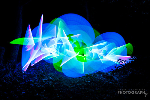
So it is a little bit outside of the scope of the blog, but this image is starting to go viral and I like it. I came to see it from blog follower Matt's twitter feed when he retweeted it from the original. You can click the image to see more images of a similar nature.

It is what happens when you play with a light-saber in front of a camera with a very long exposure time. The photography method is called light painting. Now if a reader would kindly invent a real light-saber I can claim that this piece of artwork is a wonderful example of art enriching science. Those interested can discuss in the comments (the blog owners will require 10% of any eventual profits made).


Tuesday, September 6, 2011

London International Animation Festival

The following is a video that recently aired at the London International Animation Festival. It is an amazing mixture of art and science. There is of course a lot of artistic license in the interpretation of the science, but who cares when the animation is this good! The animation is an incredible 10 minute long, stop-motion, wall graffiti, interpretation of the history of the universe and life on earth.

It seems to have won the "audience favourite" in one of the many categories considered as well, so at least one audience has chosen nicely. Well, anyway, watch and enjoy...


BIG BANG BIG BOOM - the new wall-painted animation by BLU from blu on Vimeo.


The artists' website is BluBlu.org if anyone is interested in seeing more awesome wall graffiti.